Monday, November 23, 2009

Objectified


Some of us are all told when we are young to not be judgmental. We should be polite and nice, and open to all things. Many of us assume we have grown up like this and will not judge. Despite our efforts to fight this, being judgmental is innate. This is a fact pointed out in the documentary Objectified by Gary Hustwit. He describes how every object the human eye sees, we are already judging it by its appearance, its type, its texture. When we go shopping, we are guided to what appeals to us most and this is determined by several judgment calls. As designers, when we see objects, our job is to find a way to improve things. We are to look at the problems and understand why or why not something works. As quoted from the documentary, “ Every Object tells a story,” and is designed to live out that story. A good design should be aesthetically pleasing, long-lived, consistent in detail, be useful, use as little design as possible, and the list goes on. There are no standards to what making a good design entails. There are different ways to approach design and different ways to explore ideas. In the film, Hustwit uses the example of how car designers start out from carving out from clay, not much different than a process Michelangelo would do. This shows how design comes from the mind, not from what you have. It is about what you can make and how. Objectified helps explain how design plays a role in our everyday life, and how things can be improved with a little creativity and thinking.

Umbrian Corciano, Italian Beauty


You walk through a meadow, and some lush yellow fields. You spot miles and miles of vibrant yellow sunflowers. You gaze at the little red bar, and then peer to the small hill town above it. It sounds like a fairytale, right? Well, it doesn’t feel much different from one when you’ve landed in this cobblestone wonder of a town. Corciano, pronounced “cor-chi-ano” is the name of one of the most stunning hidden treasures to ever cascade over moss colored Italian hills. Until you see a place like this, you may never believe it exists. This small hill town is located in Umbria, Italy, and is so small, its rarely seen on a map. Corciano is located on the top of a hill, with long rows of crops streaming below the towns windows. When you walk up the steep hill you enter a town of all sorts of earth toned cobblestone. Every stone is placed with such precision making the uniformity the power of its beauty. It’s built on all different levels with small streets taking you to all new neighborhoods. This town possesses so many qualities that make you fall in love with it the first time you see it. The simplicity of the design of the city is disillusioning but also shows how inspiration is everywhere and anywhere, and especially in a place like Coricano. (The pictures attached are taken when I went to study in Italy Summer 2009 with UC Davis EAP.)

Learning Colors


What is your favorite color? What colors make that color? Color theory is a complex subject that intrigues many. Color is present in our lives just as much as design. Every day we make decisions on why we choose one color over the other, and why one attracts us more than the other. But where do all these colors come from? Color is a property of light, and when we flash a light into a prism, we get a rainbow of colors. Because of this, objects possess no color of their own, but can reflect certain rays of white light, which contain all the colors. The basic color wheel consists of three primary colors, red, yellow, and blue, and three secondary colors, orange, green, and purple. Some color wheels also include the six tertiary colors blue-green, red-violet, and yellow-orange. This color wheel is one of the best for artists to refer to when trying to mix colors. Light can be a factor that affects what color may be produced. When see things go from light to dark, they may be orange in the light and completely grey in the dark. This array of how colors can change from one to the next, or even sit next to each other creates a visual appeal, something helpful in adding aesthetics to a design. The hue of a design can also be something to consider when placing color. Although the term hue is used interchangeably with color, hue actually represents the underlying tone of colors, such as red is the hue of pink, scarlet, and maroon. Using similar hues can help emphasize and create tones on the image. Color theory is a study that allows us to visually perceive how colors work against each other, together, how they change with light, and how they can be used to emphasize. Color theory is something still studied my many artists today and allows them to find many colors out of just a few, making more vibrant colors to use in art and even everyday life

Sunday, November 22, 2009

ArtAidsArt!


Stunning bead work sculptures and dolls would attract any eye. Over the past few months, I have been looking to find a job that combines two passions, art and community service. ArtAidsArt is a website that I came across and began to be extremely interested in. You click the website and right away, design is present. The colorful playful graphics of the website alone express the emotions of the organizations. The top of the page has bead dolls and pictures of beautiful children from Africa. You can go into any store and pick up a beautifully manufactured doll, but no matter how intricate this doll may be, the essence of these African handmade dolls is not present. The fact is that every artwork is hand-crafted, and made with deep dedication and love. ArtAidsArt is an extremely unique non-profit organization because it uses originally designed artwork to be sold in other countries and the profits go back to Africa. This versatile project allows two places to exchange culture and help one another. When you look at a doll, not only do you see elaborate pattern work, various beads, and complex stitching, you see the artist behind it. This artist is someone who works very hard creating these one of a kind pieces and tries to make a difference and change in their life and others around them. Attached is the URL for the website, and I encourage anyone interested to follow the link and see all the projects ArtAidsArt is working on! Also, you can follow their project blog on the second posted link.

Monday, November 2, 2009

Reflections of Intricacy


I find it funny that a sari, the traditional Indian clothing for women, went from being 6 plain yards of fabric to being the most intricate designs I have ever seen on clothes. Being slightly partial because of my Indian heritage, I find Indian clothing using the most vibrant colors, intricate embroidery, and unique designs that I have ever seen. How do they accomplish this? Of course their baffling handwork and skills contribute. And their ideas? They combine patterns and materials in various ways to create something new. One of the most known types of embroidery is called “shisha” or “mirror-work,” a material so unique, it can be considered exclusive of Indian clothing. Mirror work is said to have been used in the Mughal Empire and was popularized by the wife of Shah Jahan, the king. Mirror work is considered such an elegant art and only few can accomplish it. Because mirrors are not a material a needle can penetrate through, a technique has been developed to attach the mirrors to the fabric. An almost star like grid is created around the mirror with the needle and thread, and the mirror is literally pocketed into the fabric. This is very difficult and can be tedious when having to do this several hundred times for an outfit like a sari, but the end result is magnificent. Mirrors are such a simple material that reflects subtly in the light, attracting the right amount of attention. It is also a material used in a great deal of architecture and therefore gives clothing an organic and connectable feel.

Sunday, November 1, 2009

bum bum bi dum!


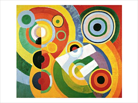
The lights slowly tilt up to reveal the dancer’s silhouette. You see a pirouette, then a crescendo of music. All of a sudden, the music slows down and you hear some drums. A few seconds later, and the audience is clapping to the rhythm. What is rhythm and why does it feel like everyone can identify it? Although most associated with music, rhythm can be used in art to give the piece some ebb and flow. In art, rhythm is defined as an element of design based on the repetition of recurrent motifs. One painting that I saw immediate rhythm in before I read the title was Robert Delauney’s “Rhythm - Joie de Vivre.” The title means “the joy of living” which captures the essence of this painting. I was first drawn to it by the vibrant orange colors, since orange is my favorite color. The painting has a modern abstract feeling to it. The unity in this painting happens by rhythm. We see recurrent elements like the geometric shapes, the colors, and the patterns which intricately tie the piece together. Your eye looks at the painting as a whole, then recognizes certain parts of the painting over and over, almost making the abstraction coherent. The use of colors and shapes create a design that allows you to clap to rhythm of this painting like it was a dancer’s performance.

Uneven Magnificance


When you walk in to the Nelson gallery, first you see an array of pattern. Perhaps next, you will notice a plethora of colors. It’s only about two minutes after you see the surface beauty of these quilts that you realize the emotion and hard work that lies in this quilt. A few weeks back, Avis Robinson, a designer of some of the quilts came in to speak with our textiles class. When she spoke of her process, I realized what a personal process quilt making is. Putting the scraps of fabric together meant so much to her, because she described it as us putting pieces of history together and representing the lives of the individuals who once wore these clothes. This is something that makes you wonder, where did every piece of this fabric actually come from? Thinking about this, I am drawn to a quilt in particular. Why? It’s the only one which is obviously off center. The quilt is called “Log Cabin” and is made by Sandra McPherson. In the middle arranged in four large squares, you see little scraps of color that seem bright, but when you look closely, they are just pieces of dull printed fabrics, that when put together, bring life to the quilt. Who wore that pink checkered fabric? Was it from an apron of a hardworking mother? I notice on piece of fabric that has writing on it that if you didn’t stare at the quilt long enough, you might have missed this subtle hint of text. The text says “made in eng” and is cut off. This seemed so interestingly ironic to me. The satire of putting a label like this on a handmade quilt just attracted me more to the quilt. Surrounding the four big squares were long slivers of black and white, and in one corner, there was extra fabric, shifting the squares up an over, making it seem off center. The black and white effectively draws you in almost an inward spiral to the color. This quilt was designed imaginatively, and with wit, and keeps the viewer pondering about the off center design, making it unique from other quilts.